Home >Design Portfolio > Service Design
Service Design
“ICA Kvantum” Täby Centrum, Sweden
Service Design: How to Design Integrated Service Experiences.
Let's clarify how Service Design relates to other ways of thinking about design:
It is different from user experience (UX) design (which is about designing the experience of products).
It is different from customer experience (CX) design. (Yes, it overlaps in considering customers— but Service Design is broader: it must also design the business processes and infrastructure that will deliver those customer experiences.)
It is not the design of 'everything'. (It is a specialization that designs services.)
It is not just 'big picture' thinking. (It needs to be both broad and strategic, as well as exact and tactical.)
It is not exactly the same as 'design thinking' or 'human-centered design'. (These are approaches to problem solving often used by service designers, but Service Design itself is a specialized discipline.)
Service Design needs to be exact to avoid failures in the service experience due to ignorance or miscommunication by either a business or a customer.
The services that are designed also need to be feasible to produce, scalablein size and financially viable.
So that’s the scope of responsibility, but let’s define in more detail what a Service Designer actually designs—a 'service concept'.
Service concepts generally address four distinct elements:
The customers’ needs and desires
The service organization’s strategic intention
The benefits customers will receive (referred to as the what)
A description of how the service should be delivered (referred to as the how)
Case Study
This is a short “20% done” Case Study of ICA Kvantum in Täby, Sweden to show the capabilities of my Service Designer skills and skills in Figma as a collaborative design tool.
Questions to answer with this case study:
Is there something in ICA Kvantum’s Service Design that we can improve on? Se summary for the answer at the end.
Negativs:
User Research lacks more hours worth of observations and user interviews. User research is done during one hour of observations.
Personas is made on the little data that the Service Safari offered. The rest is fictional to showcase how a persona might look like for ICA Kvantum.
Value Proposition Canva is answered based on the little user data that the Service Safari gave and the fictional data from the personas.
Service Blueprints (Customer Journeys) are fairly straight forward and depicts the users different paths that was inherited from the two made up personas. Though the Service Blueprints do depicts real life user journey through ICA Kvantum and their services.
Background information about the ICA Group
“ICA Gruppen’s core business is grocery retail. The Group includes ICA Sweden and Rimi Baltic which mainly conduct grocery retail, ICA Real Estate which owns and manages properties, ICA Bank which offers financial services and, since January 2015, Apotek Hjärtat which conducts pharmacy operations.”
Strategic Themes:
We are where our customers are, locally, digitally and personally, with strong and affordable customer offerings.
We earn our customers’ loyalty with a great brand, a broad ecosystem and a personalised, data driven communication.
We are committed and inclusive. Together we build a fast moving and constantly learning company.
We improve continuously and leverage technology to make it easier for our customers, improve efficiency and value for money.
We lead the development towards a more sustainable and healthy society - for a good tomorrow.
Reference: ICA Group
A service safari is an easy and effective way to get a feel for the service experience from the customers’ perspective.
Field study: “Service Safari walkthrough”
Date: Wednesday, 2021-08-25,
Time: 1:20PM-2:15PM.
From those Research Notes:
Personas, Value Proposition Canva, User Journey, Service Design Concept, Service Blueprint.
Design tool: Figma.com
Ethnographic study or Contextual Research done in the field.
ICA Kvantum Entré
All customers where very quiet and the whole store was noise free.
The elderly customers of both sexes exclusively walked with trolleys and shopping lists on small paper slips.
The only one talking was a mother with her 4 year old child in the vegetable section. No one asked for help from the staff.
The store was not crowded since it is a very large store even though lots of customers went through the store.
No cue in the checkout isles nor was there a cue at the self checkout.
After interviewing the staff it was apparent they have checkout managers making sure the buildup of cues doesn’t happen.
So it is already integrated into the Service Design.
Inside of the entrance
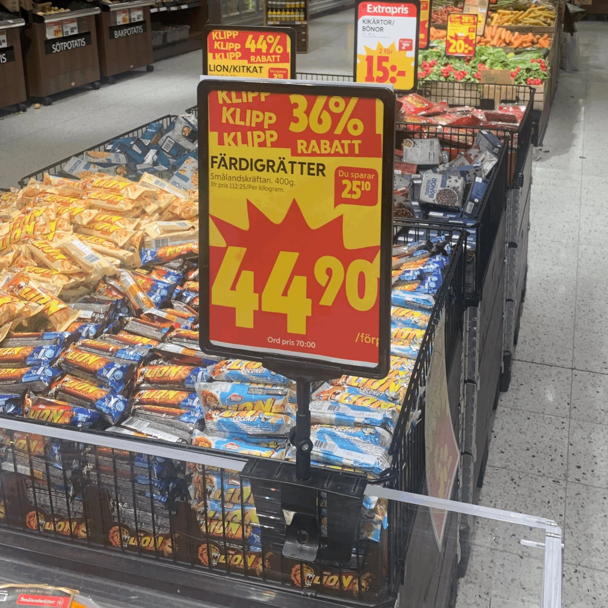
This is showing the food item signs in the store. Looks visible but you hardly notice them.
Also makes the space more cluttered.
Can they be changed to something els is one question in the Service Design that needs answering.
Just after the Entrance.
Inside entrance to the right
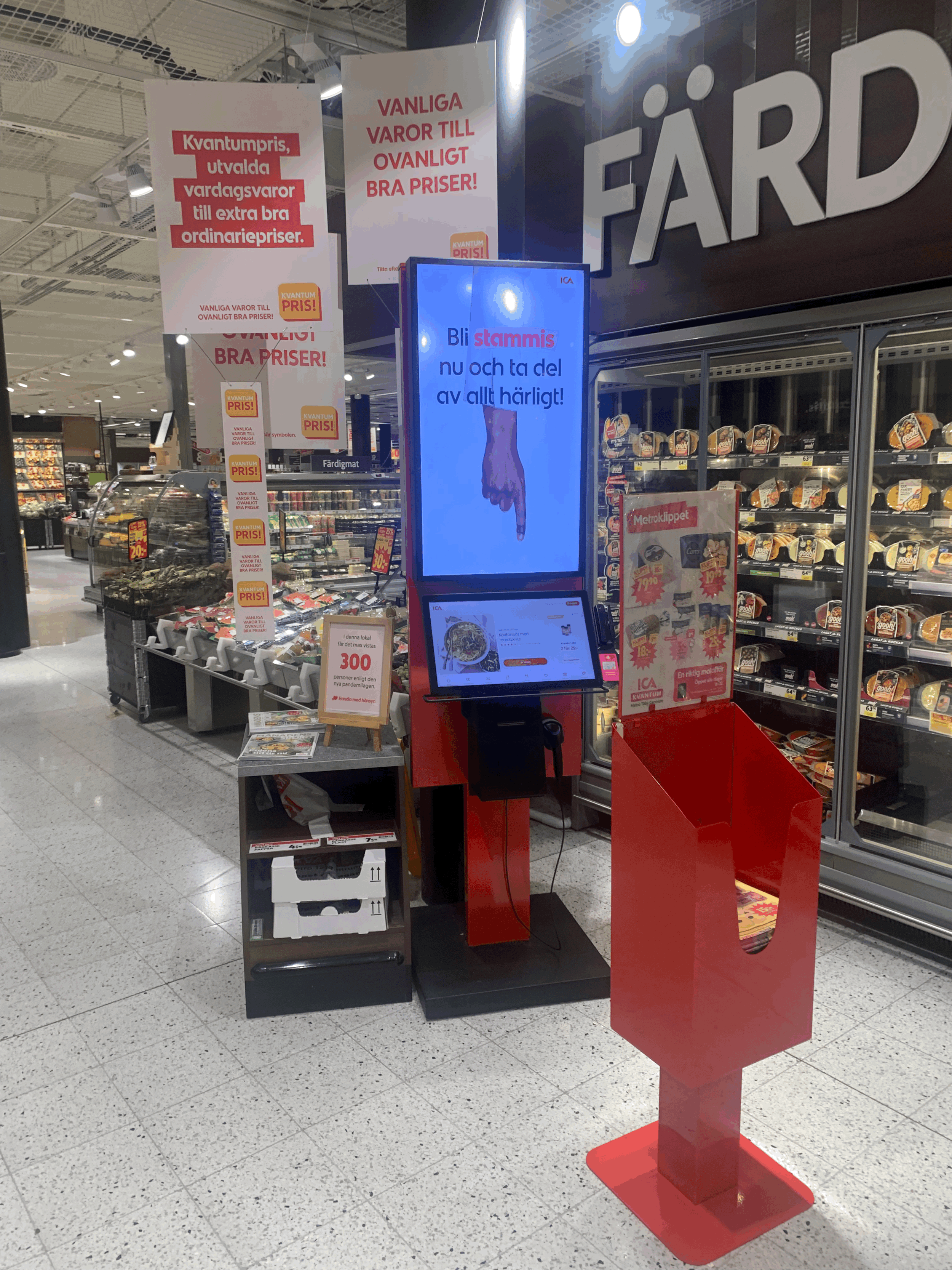
An interface at the right to the entrance to access the ICA Group website.
In front of the interface you find a red cart where they have what is on sale in paper format to grab and bring along during the shopping.
An interface to access the ICA website and look for offers
Vegetable area
Vegetable area to showcase the layout.
Picture showing the food crates in the vegetable area. The wooden crates gives the store a earthy eco friendly feeling.
Due to GDPR laws in Europe any others photos will infringe of GDPR laws. Therefore no pictures can be shown of people standing in line or elsewhere.
Personas
Persona extracted from Service Safari field study carried out 2021-08-25 between 13:20 to 14:15.
Persona of Jenny
Persona extracted from Service Safari field study carried out 2021-08-25 between 13:20 to 14:15.
Persona of Anders
User Journey Map
User journey 1
Jenny doesn’t own a car so she walks to the grocery store to do her shopping.
Anders drives his car to the grocery store with his wife when they do the grocery shopping together which they always do.
User journey 2
Value Proposition Canva
How can the business provide value to the customers?
We choose the most relevant or important customer jobs to be done and try to describe how the business can address them.
We list the services and products we offer, and then how they create gain and relieve pain for the customer.
Workshop
An example of an Ideation workshop done with above data in order to showcase how you can ideate in Figma Design or rather FigJam.
1’st ideation
Grouping
Ideation to then make user stories for the PO’s: Doing with stakeholders and gets signed off after workshop in order for requirements to get put in backloggs.
2’nd Ideation
Service Blueprint
Mapped customer Journey through the To and through the store and back home again to describe the customers interactions with the grocery store and how the service is delivered.
From here we can collaborate with different stakeholders in addressing the pain points.
High Level Service Blueprint
Here we see a more in-depth customer journey through the self checkout so that we can discuss the pain points and address them accordingly with the stakeholders.
Self Checkout
Here we see a more in-depth customer journey through the self checkout so that we can discuss the pain points and address them accordingly with the stakeholders.
Checkout with teller
Summary
This is NOT a complete Service Design Concept but more a description of some of the parts in it to showcase my abilities in Service Design.
With this showcase I hope I have demonstrated my talents in this field so that you can confidently ad me to your team to improve on your Service Design Concept or to produce one to start of with.
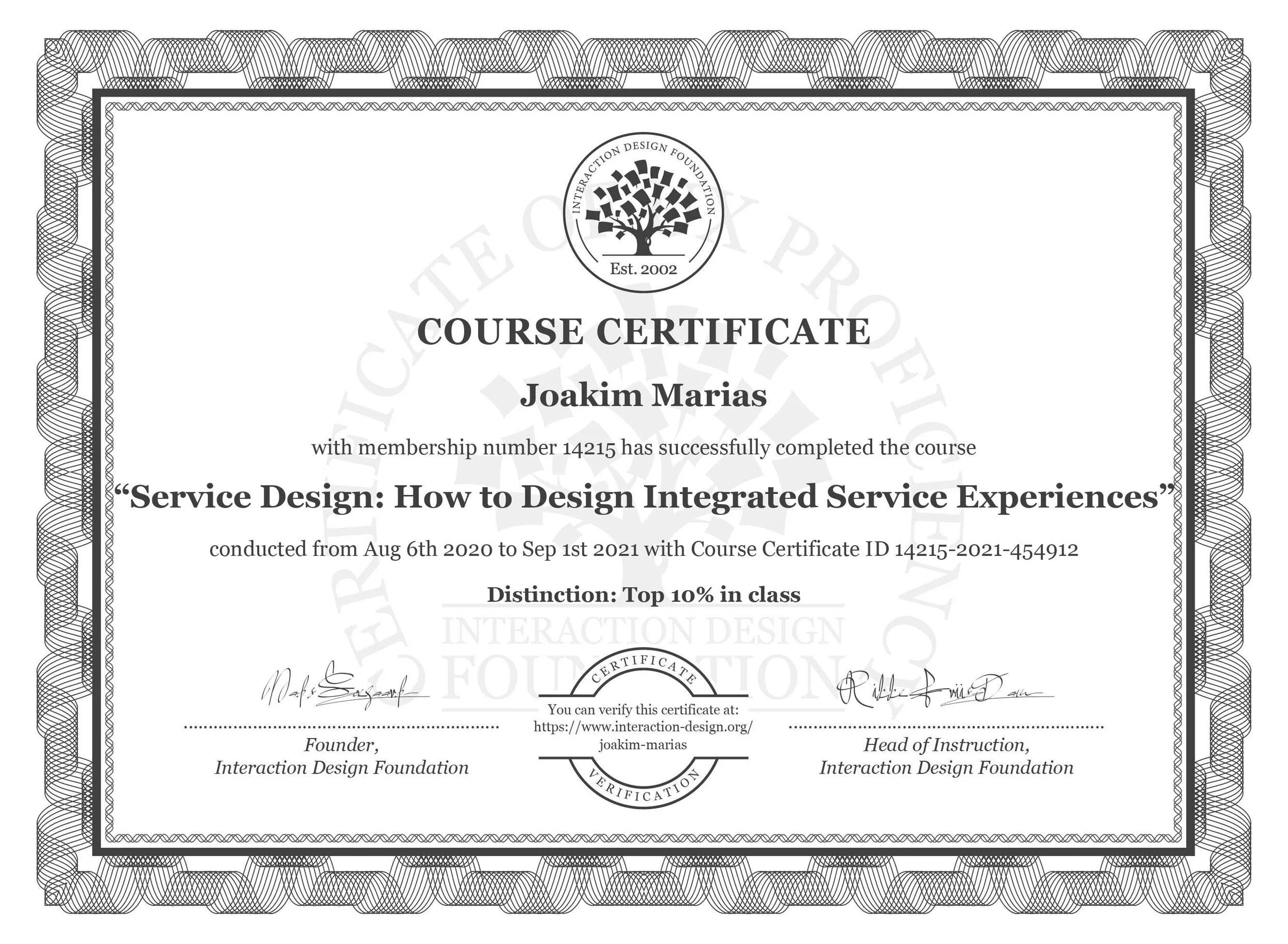
This is a product of the Service Design: How to Design Integrated Service Experiences Course at Interaction Design Foundation where “Don Norman” is one of the chairmans on the board.
The answer to the question if there is something that can be approved with the ICA Kvantum Service Design is that YES they could improve the shopping list feature in the ICA app and make the UI easier to use for the elderly. There might be a reason
Link to the course: Service Design
Tips & suggestions to adjustment to the Service Delivery:
User test the shopping list feature with 60+ years customers in contextual environment.
How more expensive is it to change the sales signs on the crates to a screen to integrate video to draw customers attention to the moving screen?
Will moving sale screen be too cluttered in a store? User test it in one store for contextual feedback.
If screens improves the Service Design Concept. How can we integrate screens in CRM so that it works for all the stores and can be managed from the head office marketing department if needs be?


